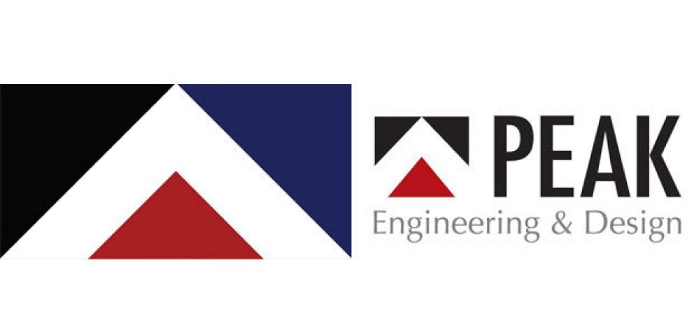
Popular flag design Red Peak is currently being used as the logo of an American engineering firm.
Peak Engineering in North Carolina has been using a logo featuring a red triangle, white chevron and two black triangles since 2008.
Red Peak, the design that has seen a swell of support for inclusion in the referendum for a new New Zealand flag, is similar, but has a blue triangle in place of one black triangle.
Company owners Beth and Jeff Roach told Fairfax they thought their company logo's similarity to Red Peak was "curious".
"It's obviously caught us by surprise. . . and we were even more surprised that people had nicknamed it 'red peak'. Obviously we're very flattered!" Mrs Roach said.
The couple had received an email about the flag debate from a Kiwi on Wednesday. Mrs Roach said she deleted the email, but more came through.
Mrs Roach said Peak Engineering's logo had been used on client gifts, including stationary and wine.
She told Fairfax it wasn't trademarked and she would grant license to anybody willing to use it.
"But I think we need to have a conversation with anybody who's interested in using it, just so we clear everything up and make sure it's all above board."
The couple live in Apex, North Carolina and Mrs Roach told the New Zealand Herald that the town's motto was "The Peak of Good Living".
"Being an engineering firm we wanted to do something with "triangles" and being located in "The Peak" we wanted to do something with the summit or the peak of a mountain. These two concepts plus the boldness of the red and black was what we were searching for," she said.
Red Peak's designer Aaron Dustin told Fairfax he had taken legal advice and there was "absolutely no copyright issue here at all".
He said he wasn't surprised the design didn't make the final four, but he believed the support for the design was because "it resonates with people".
"They see something that represents their vision for New Zealand as well as respecting our past. Something about it is uniting, and there is a sense of 'bringing us together' that many have mentioned. That doesn't come along often in national symbols."
Julie Schmidt, the North Carolina designer who created Peak Engineering's logo, told Fairfax she could see immediate similarities when comparing the two designs as drawings, but as a flag it was different.
"I think if they were an engineering firm in our state, that would be a concern. But a flag in New Zealand? That makes it kind of cool - and again, they could say it's different because there's a blue triangle."


