Ralph Body reviews Dunedin's latest art exhibitions.
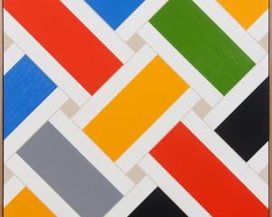
Don Driver's brightly coloured reliefs challenge the traditional boundaries between painting and sculpture. These wall-based works typically feature a series of horizontal bands, evoking hard-edged abstraction.
While many abstract paintings are concerned with the way different colours appear to advance or recede, in Driver's reliefs this takes on a literal quality. Some of his bands project forward, while other are recessed within the frame.
The surface quality of these works is further complicated by the varying materials he employs. Glossy bands made from lacquer on aluminium contrast with the matt effect of acrylic on canvas. Some reliefs feature polished stainless steel, where the reflection of the viewer and gallery space is introduced into the work.
These different textures, together with the surface projections and recessions, help reinforce a sense of the materiality of the artwork as a physical object. This is further confirmed by his use of everyday, non-traditional materials, many of which have an almost industrial finish.
The relief sculptures are complemented by a group of floor-based works such as Double Cosmos (1974). Here, a box form containing two steel tubes is divided by pieces of angled glass. These seemingly simple elements create an uncanny effect, as the strange enclosure disrupts the viewer's comprehension of space.
Traditionally, watercolours have tended to be small in scale and kept sheltered from direct sunlight, which could lead to fading.
These characteristics are contradicted by Simon Morris' monumental Black Watercolour, which spans the Big Wall of the Dunedin Public Art Gallery foyer. Painted directly on to the textured wall surface using diluted Chinese ink, the work is 2m high and 20m wide, consisting of 100 vertical strokes of equal width.
While this structuring principle and concern for measurement would suggest a modular, geometric quality, this is softened by the fluidity of the medium and the clearly handmade nature of the work.
Although constructed from vertical strokes, it is the overwhelming horizontal width of the work which predominates. This, combined with the shape of the gallery space, makes it difficult to view the work in its entirety. At the same time, however, the work feels very human in scale, with its height limited by the artist's reach.
Part of the visual appeal of the work is watching the play of natural light across its surface, as it forms a tonal spectrum from the darker strokes nearest the gallery's windows to paler tones further inside. The translucency of the diluted ink creates a sense of light emerging from within the work itself.
The Dunedin Public Library is exhibiting a selection of books from the Reed Bible Collection. While the exhibition is primarily concerned with religious history and the history of publishing, it still features a significant visual component.
Some books feature intricate calligraphy or striking typography, such as the dramatically elongated I of the Doves Press Bible (1903).
Others boast lavish illustrations, like John Ogilby's depiction of David slaying Goliath in a 1660 Bible dedicated to Charles II. The rippling musculature, elongation and decorative treatment of his figures bear all the hallmarks of the mannerist style.
Many feature decorative initials, a practice which continued in the wake of the printing press. In a 1550 English Bible printed in Zurich, the letter B shows a skeleton and demon struggling with a bishop.
Other's images make reference to royal patronage. A title page from The Byble in Englyshe printed by Edward Whytchurche in 1540 shows King Henry VIII receiving the word of God, then overseeing the distribution of the bible to the masses.
My favourite image was Eric Gill's elegantly stylised depiction of the visitation from 1931. The figures of Mary and Elizabeth appear simultaneously stilted and sinuous, helping to reinvent the contemplative stillness of medieval art for a streamlined modern age.


