(Gallery Thirty Three, Wanaka)
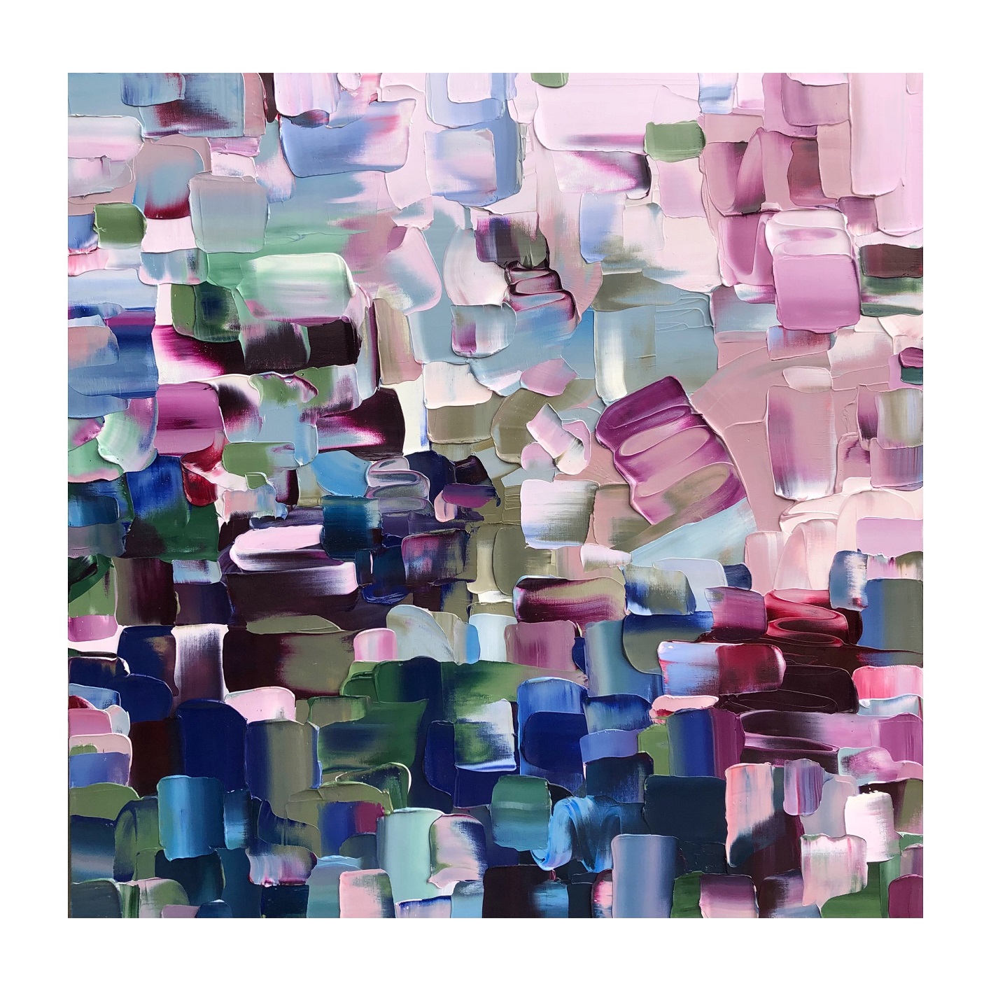
Jane Shriffer’s work is simply human happiness in paint. Emerging from blunt strokes and overlapping layers, her collections always have the effect of swirling confetti, a flurry of colour that can’t help but invoke a lightness and joy. Shriffer has an eye and innate taste for complementary tones; there’s a harmony to the way the colours meet, rise and fall, often creating a faint point of perspective even within the abstraction. The eye will follow sweeps and lines, bolts of light and receding shadows, towards a central imagined shape.
Viewers will likely be drawn to a particular canvas for its palette, like the earthy greens and cool blues of I Do Not Like Eggs and Ham, the spring-like peeks of lilac in Two Thumbs Up, the peach and moss of Add To Cart, or the pastel hues of Man’s Best Friend, the latter somehow evocative of the world after a rainfall, both dramatic and calm, everything slightly blurry around the edges. Shriffer’s titles are chosen spontaneously, denoting an everyday instant in time; they act as a marker of the artist’s hand and environment, but the works themselves seem open to interpretation. The longer you look into each canvas, more shapes and feelings seem to emerge. When people talk of abstract art capturing and communicating emotion rather than visual reality, Shriffer’s work very much embodies that phenomenon.
(Eade Gallery, Clyde)
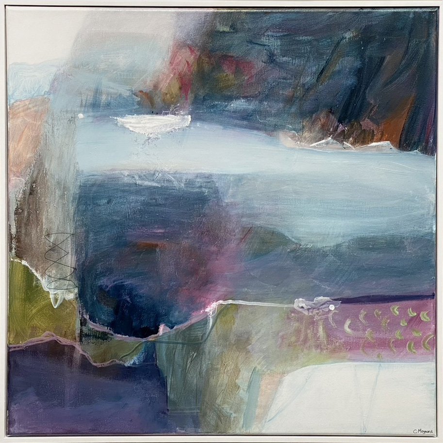
Christine Maynard creates in reaction to the environment around her — and the memories held in her mind, working through her visual response, and reshaping those sights and experiences with brush and canvas. Her work focuses on depths and layers, both metaphorically and literally in the composition.
Lava Stone is a nod to the country’s volcanic history and foundations, the unknown power lurking deep below the earth, and the great force that can explode up through ocean and land. That dichotomy is reflected even texturally, with smooth sweeps of paint moving up into roughened swirls of colliding colour. Tonally, the work shifts lighter as the eye moves upwards, perhaps bringing a final note of optimism — that eventually, no matter how much alteration and destruction is wrought, peace and light will return.
Floating on Misty Blue is a gentler work on the surface — romantic and hazy, almost a dreamscape, but the darkness of looming rock and the cool pull of the water suggest the inevitable storms and obstacles we all face, as well as the gentle moments drifting in the light. With the suggestion of a small white boat floating "on misty blue", Maynard writes of a childhood playing on the water — memories softened by time, an age and era that often seems so much simpler in hindsight. Visually, it’s a beautiful work, perfectly titled, with that allusion of the melodious and nostalgic.
(Milford Galleries, Queenstown)
In life, magical moments can occur when the ordinary seems extraordinary, if only for a little while. Damien Kurth’s still life paintings both examine and prompt that experience. At first glance, clusters of random bottles and jars seem like standard workshop paraphernalia, but the composition and solemnity is a reminder of the iconic arrangements of Old Masters, when hidden symbolism lurked in the smallest detail and the unassuming was granted a sense of majesty. Kurth uses a repeated "X" symbol in his work, a label that can have connotations of mystery and danger, treasure and romance. It can mean something, or nothing at all, simply exist as an object in itself; and Kurth excels in creating an atmosphere where the viewer questions the scene in front of them, and their own role in it, whether to take it at face value.
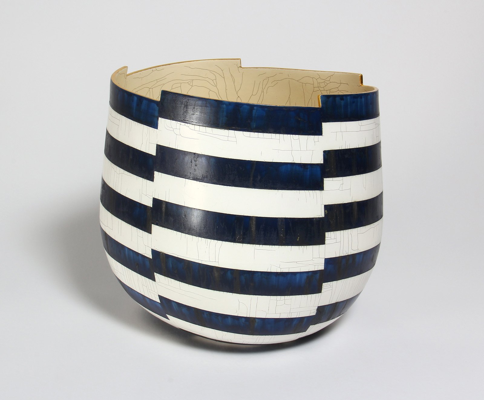
In the ceramic portion of Milford Galleries’ Review, Mark Mitchell’s vessels are fascinating, playing joyful havoc with the viewer’s vision and perception. Using shifting lines and patterns, one piece appears to be in motion, fracturing into moving segments; another spirals into ever-decreasing circles like the whorls of a fingerprint. The effect is hypnotic and slightly dizzying. The Miniature Series (Blue Diamonds) and (Black Arrows) play with negative space, as you question if you’re looking at the diamonds or the zig-zagging lines in between, or at arrows rising upwards or down.
By Laura Elliott