
(Blue Oyster Art Project Space)
"Osmologies" presents multiple interpretive avenues: not only a literal reference to the study of smells, this exhibition invites us to consider the complexity of perception and interpretation when an art object consists of a smell.
Burzynska has made a series of scent portraits. The process of making them involved oral history interviews and the distillation of the impressions of these experiences into olfactory histories or scent objects. Formulated in the artist’s laboratory/studio, the scents were then housed in associated objects or receptacles. Resisting containment yet very physically present, the works converse and combine in the gallery space.
Scents are perceptual markers that can define moments and relationships to things in the world. The nature of understanding someone through smell is considered in this way, yet the viewer’s embodied experience of the work is also at a remove from the stories themselves.
This exhibition is generative in that it provides an opportunity to think more broadly about associations of smell. The notion of a good or bad smell comes into question when we think about the subjective, objective, cultural or biological elements of smell. The smells themselves are familiar and strange, with no identifiable associations to things in the world. They are mediated by the artist and their allusive qualities really do elicit wonder and curiosity.
(Olga Gallery)
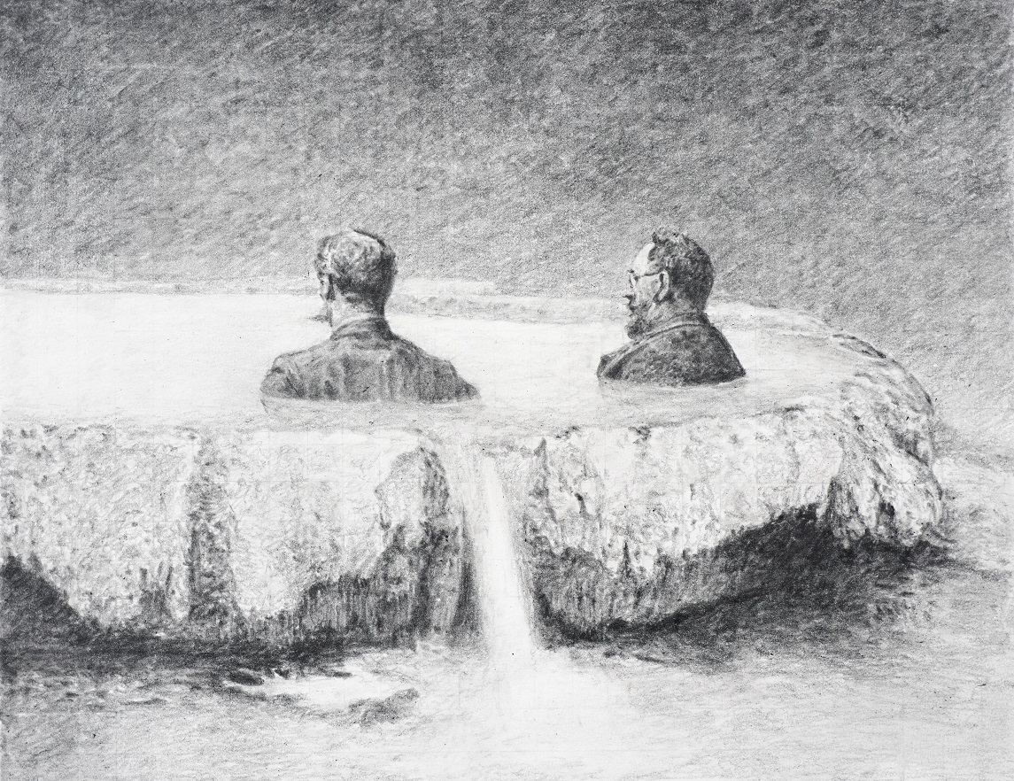
The definition of the absurd implies a lack of meaning, a contradiction, a paradox, and the sense that there is no logical connection between given things, inviting us to look at them differently. In graphite, Madill has re-worked the tensions of this notion into documented moments from the 19th century. The 1889 New Zealand and South Seas Exhibition and the Pink and White Terraces (Te Tarata and Te Otukapuarangi) are prominent examples.
Madill has had a long-standing interest in historical ephemera and photography. It generates content for imaginatively composite images that disrupt straightforward interpretations of documented histories. In this way, the drawings speak and speak again; on more than one occasion I experienced a delayed reaction to a strange element after an initial failure to notice it.
In a way, the absurd posits that it is not possible for us to understand reality. These works then question our capacity to understand history: what actually occurred at the time and what can only be imagined.
Madill plays deliberately with intention and outcome, subjectivity and objectivity, and between the real and the imagined. There appears to be an intuitive freedom in the process of making. The drawings then have space to be themselves, and they have a sense of humour.
(Tini Whetū Project Space)
"Mātātuhi? Mauri Ora!" is generous, vibrant and accessible. The printmaking on show by Tahata and Kitson represent multiple series or projects, yet while there is plenty of variety in terms of subject matter, an overall cohesiveness is achieved. The colour palette is bold: rich blues, vibrant reds, and warm greens appear across bodies of works. For both artists, whānau life is referenced as a shared departure point for their practices.
Tahata tends to work with the intaglio printmaking family. The artist refers to Māori values, aroha and compassion as governing principles for her practice: some of the prints on show, for example, are labelled as part of "a mana taiao series, in response to Cyclone Gabrielle". In other works, Tahata draws on specific carving styles, the Iwirakau school of carving for example, and playfully incorporates elements into contemporary settings like the portrait of her son.
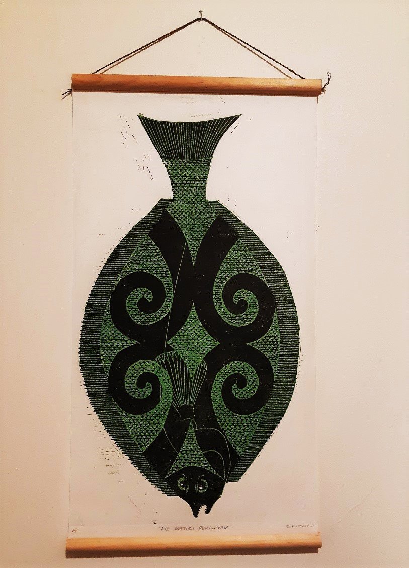
Kitson works across print media: there are detailed nature studies, like Kawakawa (2023) in seriograph/monoprint and emblematic or stylised linocuts, like Tohoraha (2021). The artist is inspired by te ao Māori and the flora and fauna of Aotearoa. A woodcut, He Pātiki Pounamu (2022; reproduced here) is one of Kitson’s larger works. The characterisation of this earthy green flounder is gorgeously animated.
By Joanna Osborne


![Anchor What? [maquette] (2002), by Morgan Jones. Plywood.](https://www.odt.co.nz/sites/default/files/styles/odt_landscape_small_related_stories/public/story/2026/04/maquette_for_anchor_what_2.jpg?itok=LCZ8lqkN)

![‘‘The Ogee & Manaia’’ [installation view] from left to right: Manifold (2025); Up up up (2025...](https://www.odt.co.nz/sites/default/files/styles/odt_landscape_small_related_stories/public/story/2026/04/1_the_ogee_and_manaia_-_exh.jpg?itok=oJXuzUv_)