
In this week's Art Seen, Robyn Maree Pickens looks at exhibitions from Don Hill, Emily Siddell and Stephen Bradbourne, and Harry Watson.
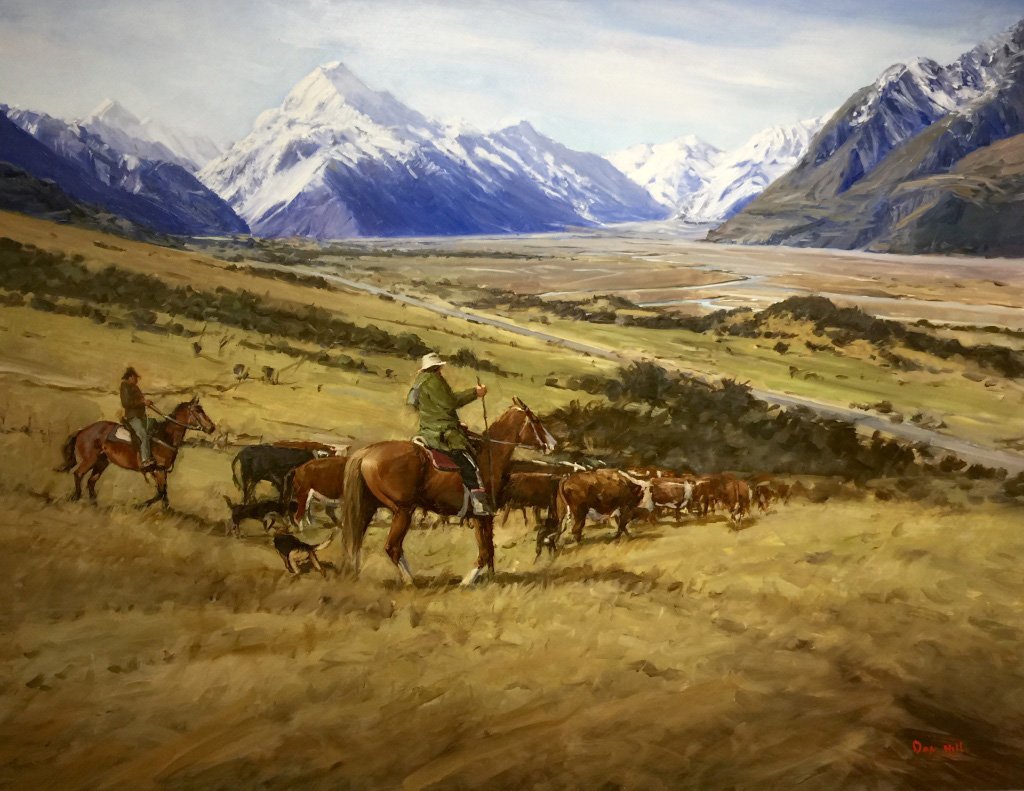 Glentanner Station, by Don Hill
Don Hill (Lakes District Museum and Gallery, Arrowtown)
Glentanner Station, by Don Hill
Don Hill (Lakes District Museum and Gallery, Arrowtown)
Don Hill's impressive exhibition of landscapes at the Lakes District Museum and Gallery encapsulates rural New Zealand in paint, capturing myriad views and slices of life. Snow-capped peaks tower above open plains, boats chug through the depths of mirror-like water, and stockmen on horseback direct their livestock through sun-drenched tussock or sheets of rain. Hill, who was profoundly influenced in his early career by a meeting with Impressionistic painter John Crump, describes wanting to depict a way of life that is increasingly disappearing into the past, overtaken by the drive of technology, development and progress; yet there is a comforting familiarity in the imagery, a sense of serenity and oneness with the land that feels somehow timeless.
Light and shadow is used skilfully to create atmosphere in Whanganui River, you can almost hear the sounds of the bush, and in coastal works such as Martins Bay, Cape Palliser and Mangatoetoe, Cape Palliser, as waves crash against the rocks and seagulls circle above tracks in the sand, the thick, textural dabs of colour create a sense of movement and energy. It's the humanity and heart in the works, however, that stands out. A genuine love for the land and people shines through, and the most everyday activities, the countless small moments that make up lives, are treated with significance and respect.
 Happy Anniversary (2018), by Harry Watson
"Against Nature", Harry Watson (Milford Galleries, Queenstown)
Happy Anniversary (2018), by Harry Watson
"Against Nature", Harry Watson (Milford Galleries, Queenstown)
Harry Watson's art is full of character, puzzles and countless thought-provoking details. Fantastical creatures do seemingly impossible things in Watson's dream-like works. He blends the familiar with the bizarre, the real with the imaginative, and often you aren't quite sure what story you're being drawn into, but the result is so fascinating that you go along with it regardless.
Many of his pieces have an ominous, unsettling effect, enhanced rather than offset by the quirkiness of his style. Figures toil in scenes of apparent chaos, smiles are sardonic rather than joyful, and skull imagery creates tension and uncertainty. The intricate wooden frames and carvings that enclose the painted imagery are testament to Watson's experience with cabinet-making, but also emphasise a fascination with medieval religious paintings and altarpieces. The grandeur of the frames contrasts with the fine lines and delicate brushstrokes in the surreal narratives.
Watson's concern with darker events of the past and his exploration into the colonial history of New Zealand features strongly in his work, with many pieces incorporating historical figures, symbols, and both native and introduced flora and fauna. There seems to be a reflection on the lasting impact of decisions made and actions taken long ago, and perhaps, the mistakes and prejudices that are continuously repeated.
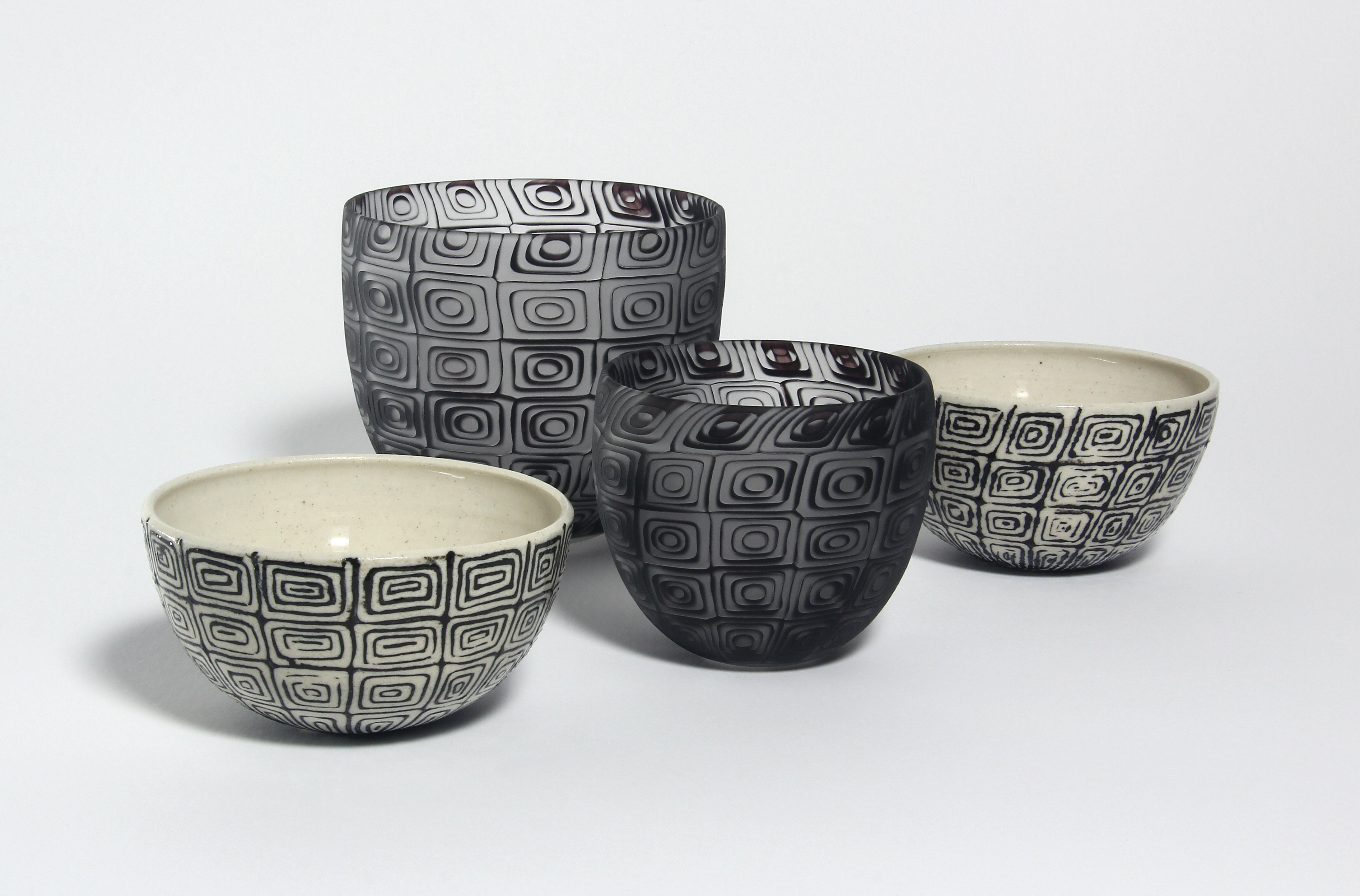 Concentric Bowl Set, by Emily Siddell and Stephen Bradbourne
"Juxtapose", Emily Siddell and Stephen Bradbourne (Milford Galleries, Queenstown)
Concentric Bowl Set, by Emily Siddell and Stephen Bradbourne
"Juxtapose", Emily Siddell and Stephen Bradbourne (Milford Galleries, Queenstown)
Emily Siddell and Stephen Bradbourne's life together is expressed in their art, with their joint exhibition "Juxtapose" interspersing their different media and styles into one cohesive body of work. Siddell, a ceramic artist, counts glass artists among her formative influences, while glass artist Bradbourne began his career in ceramics, and that crossover and the mutual inspiration they find in each other is clear in each beautiful set of vessels.
"Juxtapose" seems to be grounded in the elements, with air blown into the glass and the ceramic shaped from earth, and the designs reflecting the spirit of the artists and the colours and textures of nature. The opacity of the ceramic pieces situated against the translucency of the glass is incredibly effective. The use of repeating pattern creates a consistency for the eye where you might have to look twice to realise you're seeing bottles created by different hands out of materials with very disparate properties.
Contrarily, in most of the collections the similarity of pattern highlights the contrasts between the solid ceramic and the deceptively fragile glass. While Siddell's decorative patterning is confined to the exterior, Bradbourne's is embedded within the structure itself, and with the opposition between dark and light, solid and sheer, the effect is almost like seeing a photograph and its negative, each enhancing the other.


![Anchor What? [maquette] (2002), by Morgan Jones. Plywood.](https://www.odt.co.nz/sites/default/files/styles/odt_landscape_small_related_stories/public/story/2026/04/maquette_for_anchor_what_2.jpg?itok=dZ-h_JE8)

![‘‘The Ogee & Manaia’’ [installation view] from left to right: Manifold (2025); Up up up (2025...](https://www.odt.co.nz/sites/default/files/styles/odt_landscape_small_related_stories/public/story/2026/04/1_the_ogee_and_manaia_-_exh.jpg?itok=59EIuzf2)


![Marama [detail] (2025), Whaka Oho Rahi and Benhar clay, salvaged glass from Ōtepoti harbour and...](https://www.odt.co.nz/sites/default/files/styles/odt_landscape_small_related_stories/public/story/2026/02/1_jess_nicholson.jpg?itok=J6OKuRzC)