
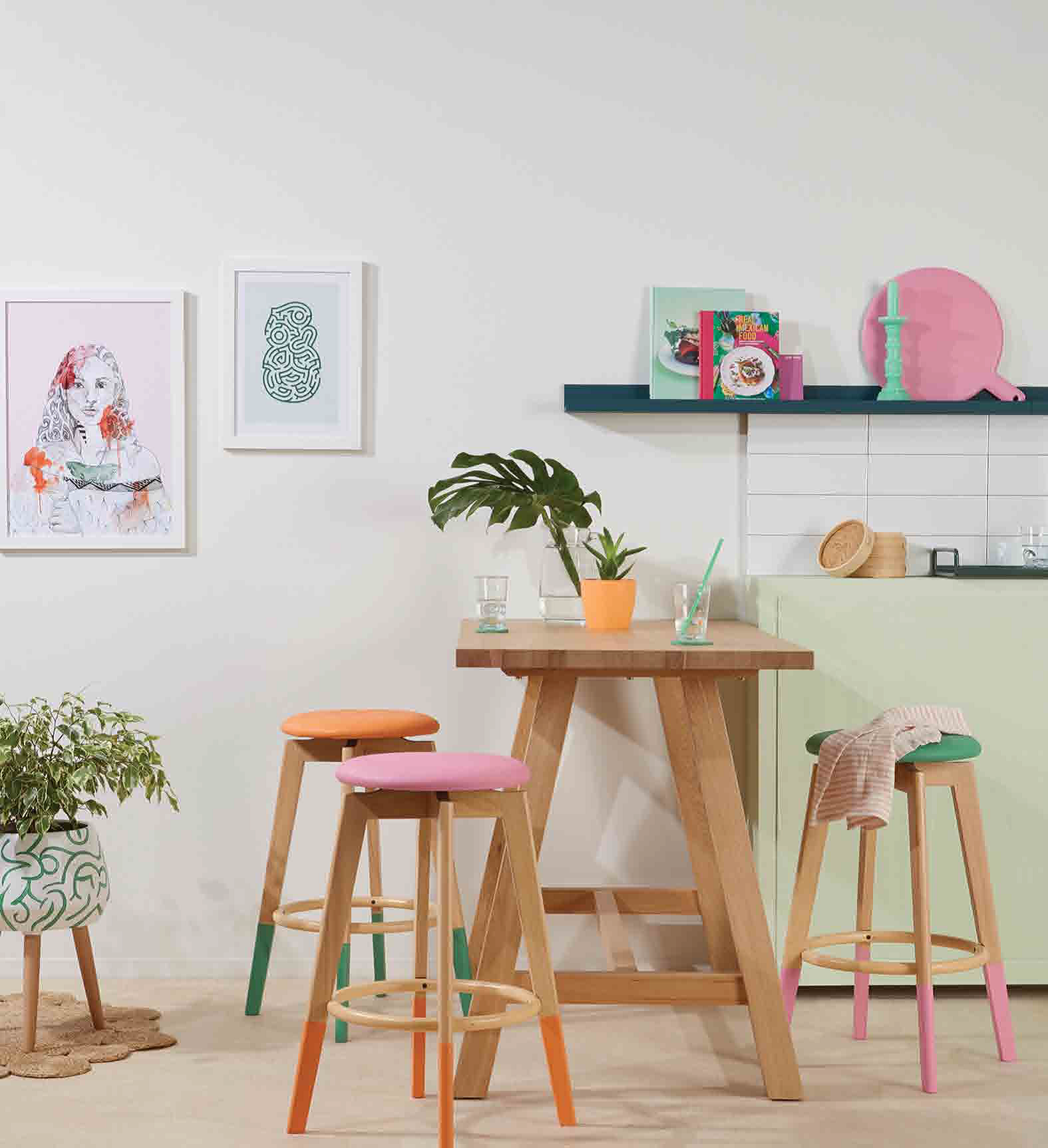
 This kitchen uses a softer interpretation of a colour predicted to take us by storm next year, Neo Mint. Resene Aura is a pale minty green that pairs perfectly with warm whites and other colours used here: Resene Atlas on the shelf, and a range of fresh tones on accessories and stools like Resene Party Zone (orange), Resene Away We Go (green) and Resene XOXO (pink). (Styling by Kate Alexander; Image by Bryce Carleton) |
Whether it’s the depths of winter or the height of summer, fresh floral tones and sunshiny colours will bring a smile to your face, and a spring to your step. These are the classic pick-me-up colours. The psychology behind colours tells us that light bright tones literally make us feel good. The impact of different colours on our mood is a huge and fascinating area of human psychology.
There are some broad guidelines you can use but for every positive colour association — such as red for warmth or blue for serenity — there is also a flipside connotation such as aggression for red or coldness for blue.
Says Dunedin Resene colour consultant Jill Marsh: “Our relationship and response to colours is also very personal, based on our own experiences, memories and associations. One person’s sunny saffron is another’s garish gold; where one person may find pastels relaxing and serene, another may find them insipid and bland. The best advice is to trust your instincts and your personal taste. After all, nothing is going to make you happier than seeing a colour combination you have chosen simply because you like it.’’
On-trend feel-good colours
Yellow:
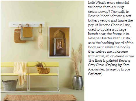
The obvious colour to lift your spirits is the colour of the sun. At its sunshiny best, it lifts the spirits and as a rich gold, it feels luxe and confident. It’s the colour of optimism, confidence and creativity. Happily, yellow is a key trend this year. It arrived in darker tones as ochre and mustard, often used as an accent, but has now matured into paler hues as we’ve become used to its strengths and been charmed by its freshness. More citrus-style lemons may be used as accents rather than full-room treatments, but yellow-based creams and soft sorbet yellows can be used more extensively. Try hues like Resene Moonlight and Resene Crowdpleaser. Beware of using too much yellow though — it may be best as an accent. Walls painted in yellow will reflect on themselves, making the colour even more intense. Buttery yellows are easier to live with.
The obvious colour to lift your spirits is the colour of the sun. At its sunshiny best, it lifts the spirits and as a rich gold, it feels luxe and confident. It’s the colour of optimism, confidence and creativity. Happily, yellow is a key trend this year. It arrived in darker tones as ochre and mustard, often used as an accent, but has now matured into paler hues as we’ve become used to its strengths and been charmed by its freshness. More citrus-style lemons may be used as accents rather than full-room treatments, but yellow-based creams and soft sorbet yellows can be used more extensively. Try hues like Resene Moonlight and Resene Crowdpleaser. Beware of using too much yellow though — it may be best as an accent. Walls painted in yellow will reflect on themselves, making the colour even more intense. Buttery yellows are easier to live with.
Green:
This colour is everywhere and in many forms. It’s been seen as sludgy and army-style, as rich jade, as fresh and botanic, retro and mint, and soft and sagey. Anything goes with green at the moment, but for a fresh uplifting vibe try minty greens, apples and sages, such as Resene Peace, Resene Helix and Resene Nourish.
Colour forecasters are predicting the rise of a colour called neo mint, which is not only oxygenating and fresh but harks to a digitised retro 1980s feel. Try Resene Kandinsky or Resene Aura to bring this fresh mint into your project. Green is good for you. It’s associated with vitality and freshness, but also harmony and relaxation. Breezy spring greens also work as neutrals, and when layered in tonal shades make a room feel sun-drenched and energising. Layer your greens as you see them in the garden, with varying types of greens — apple, grassy, blue-edged, light and dark — and pair them with natural materials, from white linen to wicker chairs.
Pink:
This is at the soothing end of the “happy” spectrum, and is a colour that continues its march through recent trends. It has begun to leave the dusky more saturated biscuit and salmon tones behind, becoming fresher, lighter and often with a lavender twist, such as Resene Ethereal.
Pink has become a genderneutral colour and is being used as a whole room scheme outside of bedrooms where it used to languish. Pink is the colour of cherry blossom and innocence. Sweet blushes and pink-tinged neutrals are nonconfrontational and easy to live with. Pink is a nurturing colour that will make you feel safe — always a good basis for happiness.
Watermelon red:
Red is a colour known to stimulate the senses and the appetite. It’s the colour of love and sensuality. Watch for red as it returns to our interiors. As a way of experimenting, try fresh watermelon or fruit pink-reds, such as Resene Red Herring. They’re easier on the eye than more intense reds; try them as accents or if you’re brave, as a feature wall.


