There’s one sure-fire way to feel at home with our interiors – let them echo the natural world around you.
Many of us gravitate to the colours and textures that we are used to seeing all of the time, especially those that anchor us, the colours of the ground and earth. There’s the rich dusky brown of the soil, the shale grey and shadowy blues of the mountains, the multiple tones of river rocks.
In a country like New Zealand where stunning landscapes are all around us, we’re spoilt for inspiration. And chances are if it looks great out of the window, it will look good inside too.
Our vast stretches of coastline offer a wealth of inspiration – white sand, black sand, sea, surf, shells, kelp and seaweed, shoreline plants like grasses and toi, rocks of all colours.
The trend in recent years for pales greys and icy whites in our interiors may seem to fit with a nature-inspired scheme but such cool, steely colours are rarely naturally occurring – they belong more to our built and urban environments.

Neutrals warm up
Neutral interior colours are now veering towards warming tones, so creamier whites are replacing stark whites. Rich browns and caramel mid-tones are replacing charcoals and pale greys.
Neutrals colours, generally, are becoming richer and muddier.
Says Dunedin Resene colour consultant Jill Marsh: “Earthly based neutrals are very comfortable relaxed colours which work well with natural timber floors, stone and brick feature walls. They feel warm with a homely edge. To bring in some texture and a natural look to the colour scheme look at linen fabrics for the curtains and cushions. Natural rugs and throws add layers of texture giving the room a feeling of being connected to nature.”
She recommends trying Resene Bison Hide, Resene Drought, Resene Akaroa, Resene Truffle. These colours come in many different strengths.
Perhaps we are drawn to these types of colours as an antidote to our online worlds, where bright colour and blue screens glow at us all day, and vibrant advertising messages and product packaging strive to catch our attention.
Soothing neutral tones allow us to recharge and recalibrate, giving our senses a much-needed break.
How to use warm neutrals
Literally carry your Resene paint charts or swatches outside and hold them up against natural elements. You’ll be surprised that the paint colour you thought was a stone brown or a leaf green doesn’t match. And that you will need to choose a colour that has a much muddier look – a green that’s almost grey, for example.
A handy tool when looking at paint colours is to use the grey viewing card Resene provides. It’s true grey so you will quickly see the subtle tints of brown or green in your chosen colours.
Because warm neutrals are very subtle colours and there is such a vast range available at Resene, Jill Marsh advices to always test your preferred colours by painting Resene testpots on a large piece of card so you can move it around the room and view both during the day and at night.
Work on texture and tone
Colours in nature are rarely one tone only – look more closely at anything as small as a pebble to as grand as a mountain. Mountains are grey, right? Depending on the light and time of day, they can be stony brown, inky blue or frosty cream.
And few natural objects are one texture. Think rough earth, knubbly bark, smooth river pebbles, glossy leaves, satiny petals, glimmering shells…
Let nature lead the proportions of colour you use. In nature, the ground plane is often dark (earth), while the middle is lighter (bush, trees, landscape) and the top is light (sky and clouds). These sorts of intensities traditionally translate to your room – a darker floor covering, mid-toned walls and a pale ceiling. Imagine how odd it would feel having a dark brown ceiling and white floor; we’re just not used to it.
Enliven with accents
Warm neutrals are hugely forgiving and can be used with free abandon on your walls. Warm neutrals can look superb and subtle with a good variety of texture and changes in fabric and accessory type, but accent colours can help enliven a neutral scheme.
Says Jill: “Introducing a statement accent colour like strong deep greens - try Resene Atlas - and gorgeous deep blues like Resene Indian Ink can create a hint of drama. Resene Moccaccino is a lovely red based brown that works well with warm neutrals.” Others to try are Resene Coast which is a stark blue or Resene Green Meets Blue which is a soft grey green.
Top tip: To use your own nature photos for inspiration, load them into the Resene Colour Palette Generator and it will suggest Resene colours for you to help get you started. See www.resene.co.nz/picturepalette
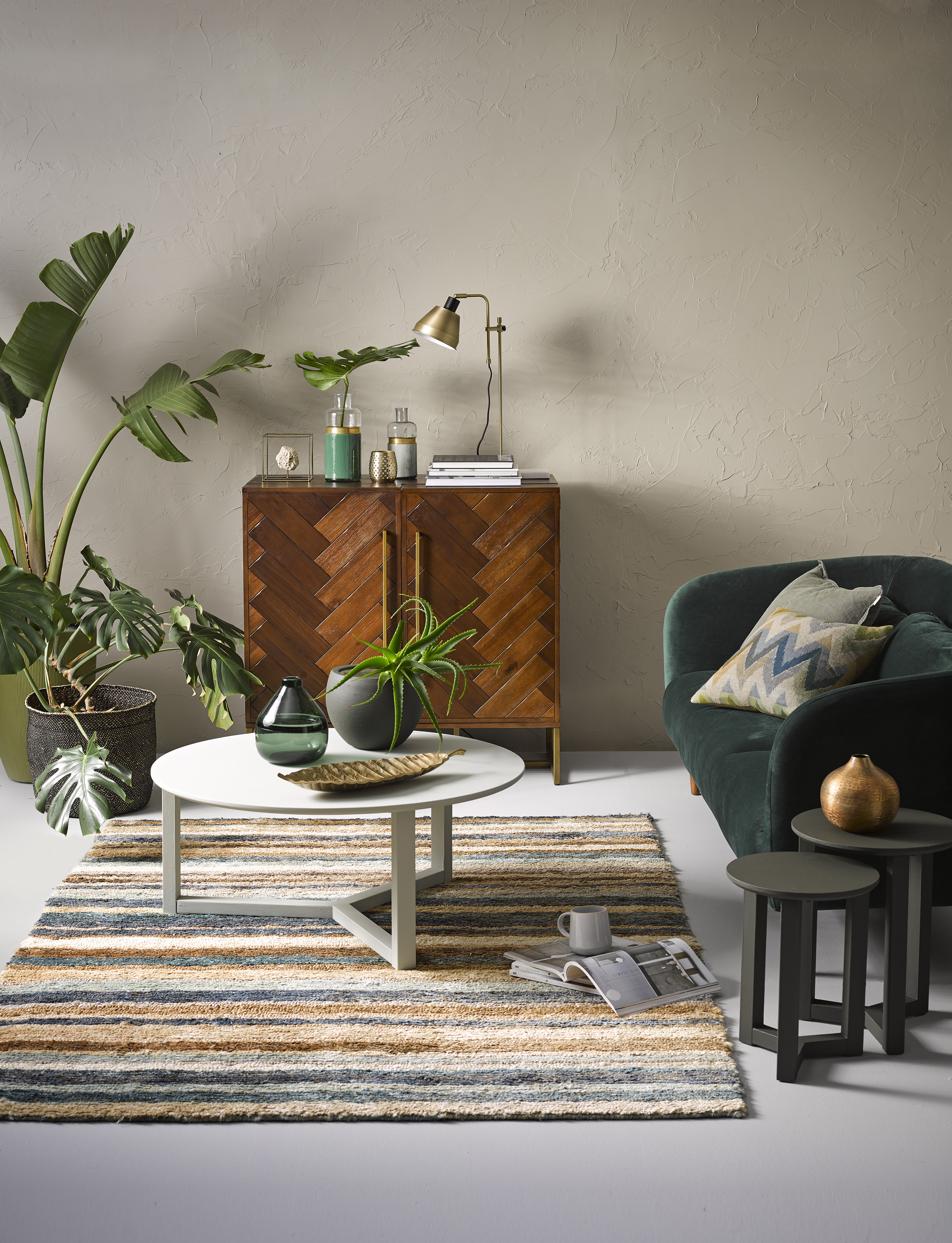
The Mediterranean-style wall effect in this living room brings texture and warmth and was created using Resene Resitex Plastercote. It’s topcoated in Resene Double Ash, an earthy neutral with a hint of green. Warm accents of rich timber and the striped rug are complemented with rich greens. Aside from the forest green velvet sofa, there are accessories painted in Resene New Leaf, Resene Karaka and Resene Permanent Green. The side tables are painted in Resene Karaka, the coffee table is in Resene Helix and the floor is in Resene Silver Chalice.
Styling by Claudia Kozub; photography by Melanie Jenkins.
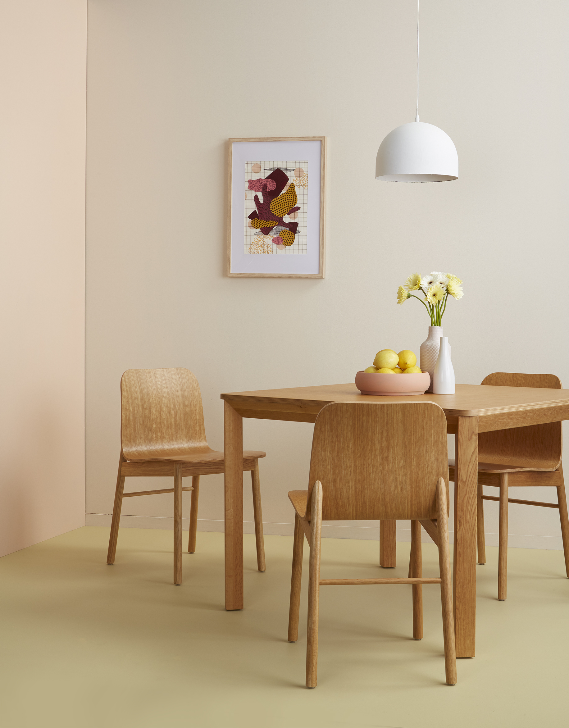
In this dining area, warm neutrals err on the rosy side. The walls are in Resene Despacito, a barely-there blush, offset with a rosier Resene Soulful accent wall and Resene Yuma floors – an olive yellow with less of the buttery quality. Warm gold-toned woods are a natural fit for a palette like this one and their modern shapes and simplistic style create a contemporary setting.
Styling by Laura Lynn Johnston; photography by Bryce Carleton
Resene Tea is a classic warm neutral that hits the top of the popularity charts for good reason. Versatile and easy to live with, it’s used here as Resene Half Tea for a more contemporary space. It proves to be the perfect background for house plants and a luxe fur throw. The floor and tree stump are painted in Resene Sea Fog.
Styled by Amber Armitage; photography by Melanie Jenkins
Warm neutrals don’t have to be all about earthy schemes, but can be used successfully with pops of bold colour. Here, the antiqued cream Resene Rice Cake is used on the walls, with Resene Tablelands on the skirting boards and architraves. The plywood floor brings a texture warm neutral to the scheme and is protected with Resene Aquaclear, a waterborne urethane. The accessories pop in Resene Smitten, Resene Twisted Sister and Resene Hive, and leftover paint has been used to create the artworks.
Styling by Kate Alexander; photography by Bryce Carleton