
PHOTO
Do you have renovation plans in the coming year? Start putting your planning ideas and inspiration together with these tips from our Resene colour experts on what colour palettes are popular and what combinations will give you a timeless finish that feels contemporary.
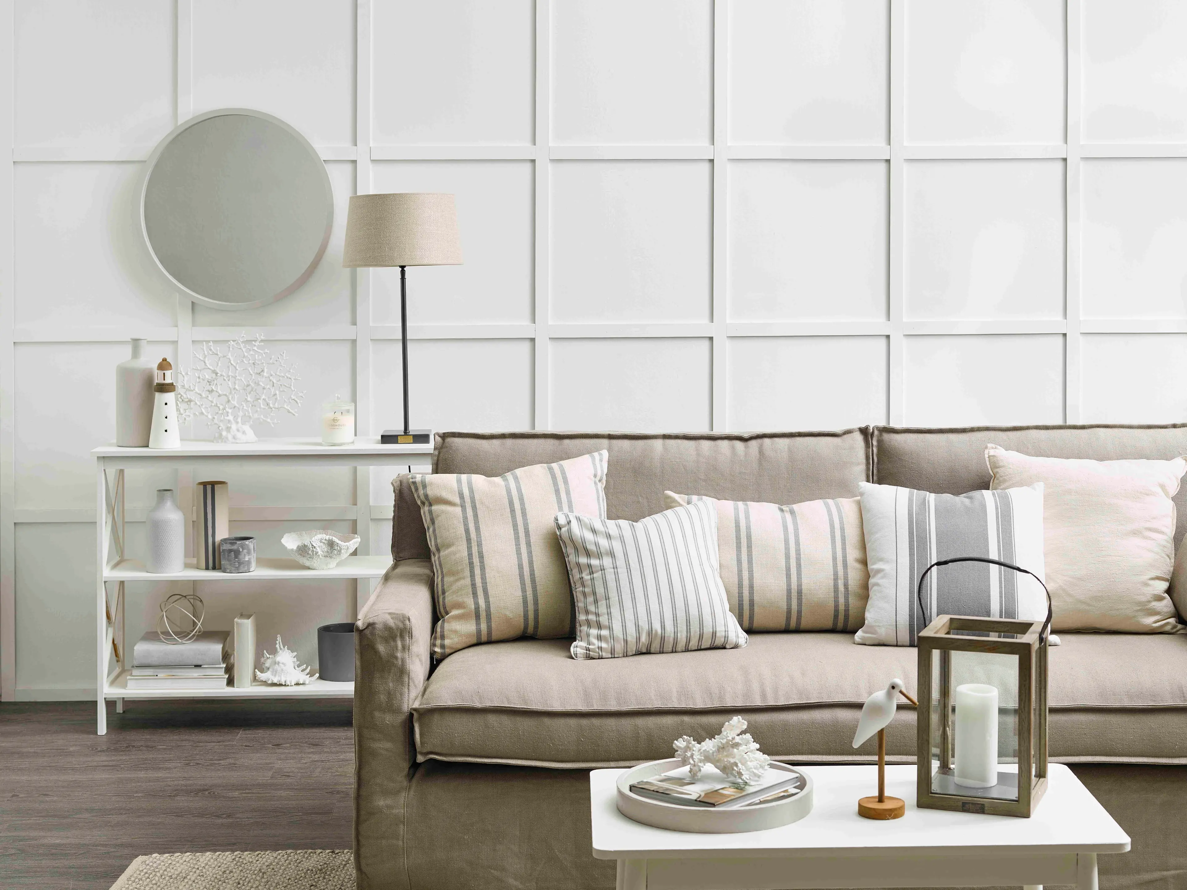
Amy Watkins, Resene Colour Consultant
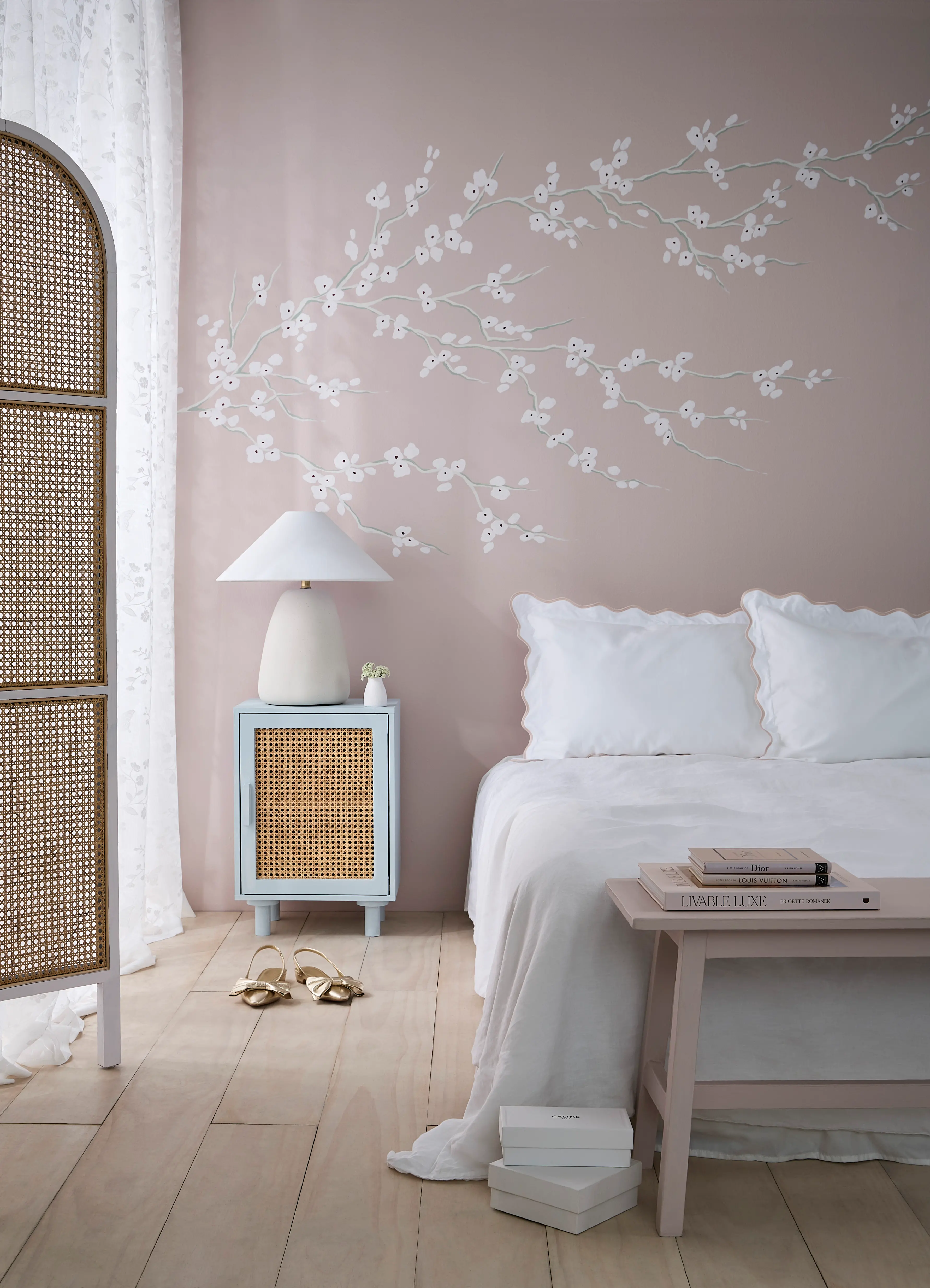
Pale neutrals such as Resene Merino, Solitaire, Quarter Tea will continue to be popular as they create an airy, timeless backdrop. Expect the introduction of blush pinks like Resene Sakura, one of my colour picks of the year, and Resene Soothe, as well as powdered blues like Resene Duck Egg Blue and Breathless. These pastel accents add gentle colour without overwhelming the space. They feel dreamy and playful, softening edges, lightening the visual mood, and making a room feel more inviting and imaginative.
For bolder touches, try burgundy shades such as Resene Merlot and Courage to anchor the palette. Without these deeper tones, the scheme can feel too sweet, with it, the space gains richness, maturity and subtle drama.
While pastels are still being used, cooler-based colours are also making an appearance. Think colours like soft lilac Resene Breathless, pale blue Nebula and grey-blue Link Water, my second colour of the year, for both interior and exterior spaces.
Christine Hodges, Resene Colour Consultant
When it comes to neutrals customers are still using the always popular Resene Alabaster, Black White, Half Merino, Quarter or Half Thorndon Cream and the whole White Pointer family from quarter strength through to triple.
There is, however, a shift to other complex whites and neutrals like Resene Quarter Albescent White, Quarter Sandspit Brown and Quarter Akaroa. Warmer neutral tones work well with popular modern materials like stone, timber, bamboo, linen, and leather for a look that evokes the Taj Mahal or Japandi and Scandi styles.
My favourite for 2026 is Resene Half Rice Cake, which I have just decorated with. As a warm neutral it works well with artworks, linens and practically any colour, bold and subtle.
Hannah Lynch, Resene Colour Consultant
2025 was a year of adventurous colour choices, taking an ‘‘anti-trend’’ approach. I think this more expressive approach will carry into 2026, but with more refined and grounded pallets.
I expect earthy palettes to remain strong in 2026, with deep greens like Resene Saratoga, soft charcoals such as Boris, and warm, earthy oranges like Tuscany continuing to add depth, warmth and a connection to nature.
In 2026, I also think we’re going to see complex hues that sit somewhere between muted tones and full vibrancy. Rich, earthy colour combinations will be paired with softer neutrals, moving away from strictly monochromatic schemes. An example of a palette that meets that description would be Resene Retro, Go Ben, Persian Red and Eighth Bison Hide. Space will feel more lived-in and shaped by personality through carefully introduced colour, textures, and cherished furnishings, rather than striving solely for a sense of luxury.
My favourite colour for 2026 is Resene Bull Whip, a strong green ochre hue that offers a distinctive take on an earthy palette. It works beautifully to create warmth and character, while feeling fresh and modern when used as an accent against charcoals like Woodbark and other soft neutrals like Half Astra.
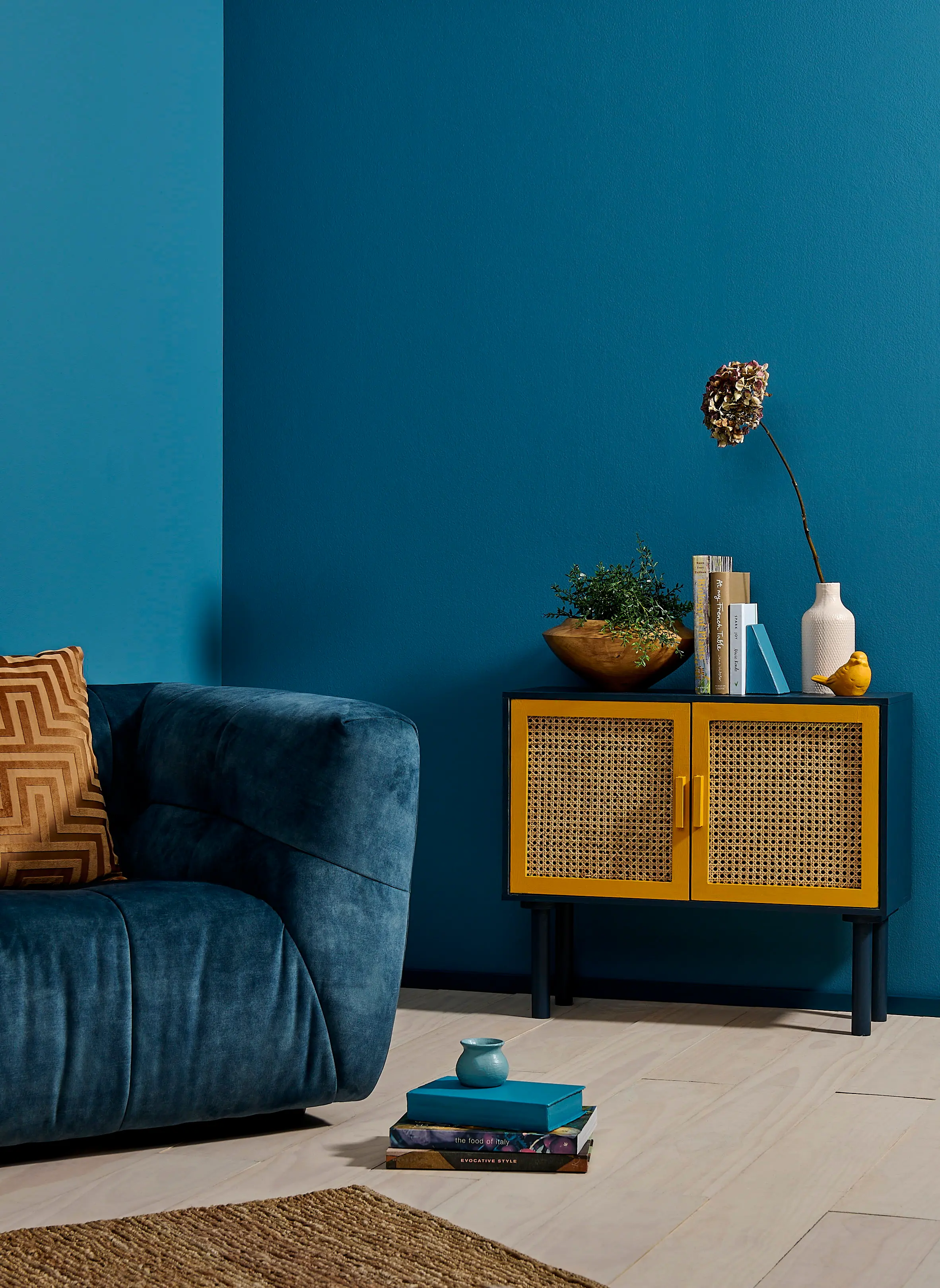
The trend I see continuing is creating spaces with character and depth, with mossy greens and indigo blues remaining dominant. Try these colours combined with the new tan and camel neutrals. One such palette might be earthy Resene Twine walls with deep Palm Green cabinetry and an organic black like Zeus for trim, hardware or furniture.
Layering of both colours and materials is another defining design focus for 2026, shifting away from staged minimalism toward spaces that feel lived in where depth is created through a mix of textures, using both pale and richly saturated colours, and a mix of different paint finishes from Resene SpaceCote Flat through to Super Gloss. It’s a design movement that naturally celebrates artisanship.
Personally, I love blues and greens so one colour I will be working with this year is Resene Dark Knight. It has been an established part of the Resene colour system for a long time and is a modern classic; a deep blue with surprising warmth and movement. It works particularly well at night because of its complexity and pairs well with soft pinks and terracotta’s like Florentine Pink or Crail.
Veronika Vuletic, Resene Colour Consultant
In 2026 warm whites like Resene Rice Cake, Half Thorndon Cream and Albescent White are taking the lead over starker whites in interior design because they create spaces that feel inviting and lived in. Where cooler whites can feel clinical or flat in some spaces, warm whites carry subtle undertones of cream, beige, or soft yellows that give walls a gentle glow. This often makes rooms feel comfortable and approachable while still maintaining a neutral canvas.
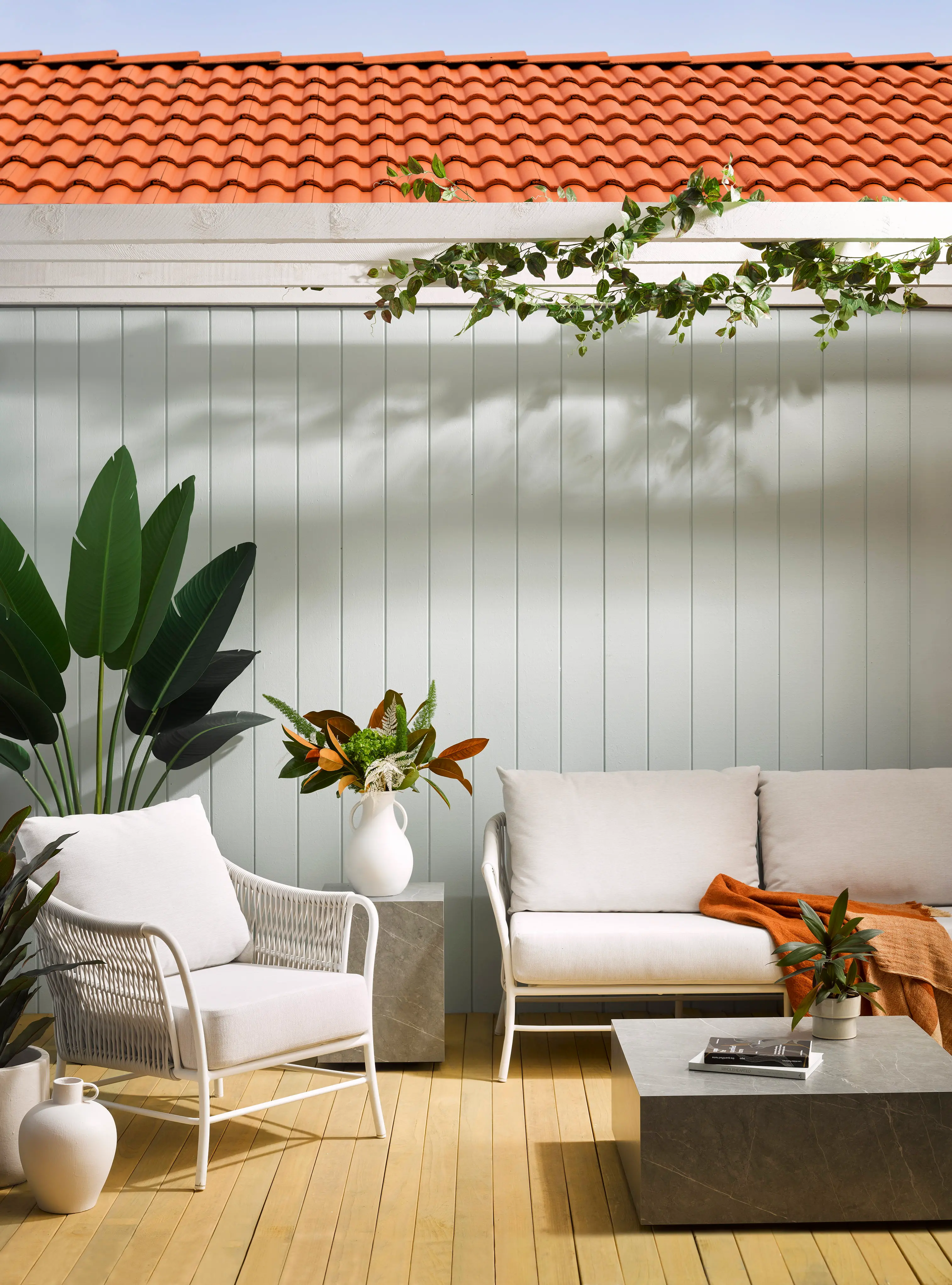
2026 is all about creating interiors that feel calm, warm and intentional. Homes are no longer showrooms, but spaces that reflect personality and time. Colours and design trends coming to the fore are earthy and grounded. Think dusted blues paired with chocolate browns, such as Resene Rolling Stone and Brown Pod, or muddy greens like Saratoga paired with warm ochres like Grasshopper. These pairings combined with natural woodwork and layered textiles, add drama, character and depth, shaping a room that feels meaningful and alive. We are all for spaces that feel lived in over perfection this year. Resene Arthouse would be my top choice for 2026. It is a beautiful colour with hints of burgundy and plum, exuding warmth, intimacy, and confidence. Its versatility allows you to pair it with both soft and bold finishes, creating spaces that feel cosy yet intriguing.
Going further
Pantone created quite the debate with its announcement of Pantone Cloud Dancer as its colour of the year for 2026. Described by Pantone as “a billowy white that serves as “a symbol of calming influence in a society rediscovering the value of quiet reflection”.
One thing we know at Resene is that versatile whites like Half Black White, a close match for Cloud Dancer, are perennially popular with customers looking for neutrals that feel crisp, calming and clean when layered with other whites and neutrals, while elevating bolder jewel tones or rich earthy hues.
Meanwhile another international colour forecaster Colour Marketing Group (CMG) has gone in quite a different direction naming an upbeat, bold orange hue full of warmth and energy called Wonder as its colour of the year for 2026.
In home décor and accessories, bold, fiery oranges like Resene Daredevil, Chilean Fire, Grenadier and Clockwork Orange work as a visual exclamation point. Try one as an accent shade against warm minimalist backdrops, or in a high-gloss finish like Resene Super Gloss Enamel or Enamacryl as a bathroom splashback or in semi-gloss Resene Lustacryl, as a contrast colour block behind your sofa. For a bigger burst of colour try a matte feature wall using Resene SpaceCote Flat to create a suede-like finish.
Pair your bold orange with greige browns like Resene Half Stonewall, muted violet blues like Astronaut, smoky lavender like Echo Blue or warm greys like Innocence.